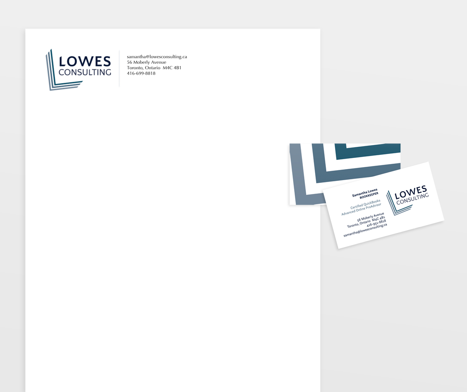
This logo and stationery was developed for the busy owner of a bookkeeping business. The logo’s stylized “L” (a mark that also represents a stack of well-ordered papers) reflects her brand values: organized, detail-oriented and client-focused.
The client was thrilled with her new identity and—since introducing it—has continued to grow her business and its loyal client base.
Lowes Consulting
Logo + Identity Design
Client Feedback:
Heather at corbin creative perfectly captured the essence of my business and which has helped me brand my business… I really appreciated her general marketing knowledge and turnaround time. Most importantly, Heather’s design work is creative, artistic and effective. I would highly recommend corbin creative for logo and design work.
—Samantha Lowes, Owner, Lowes Consulting