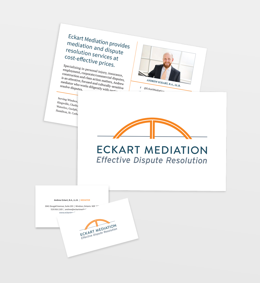
Andrew Eckart is a Windsor-based lawyer providing mediation and dispute resolution services. Andrew wanted a logo that was professional, calm, and indicative of the connective nature of his services, bringing together clients to effectively resolve disputes.
The Eckart Mediation logo uses a conservative, friendly sans serif typeface and a mark that represents both a sideways “E” and an “M” and a sturdy bridge, which is in line with the sense of “coming together” that defines Andrew’s work. The use of orange works well as a bold punch contrasting a more restful blue-grey colour. It also allows Andrew to stand out in a crowd of more muted/traditional lawyer brand palettes, and pays homage to his unique hair colour.
Eckart Mediation
Logo + Identity Design
Marketing + Promotion