Oldie and Goodie: The LFO 2010 Annual Report
’Tis the season for annual reporting, and I want to take a moment to share an annual report design from almost a decade a go that still stands out—and in my opinion, always will—as being a fine example of how a mass of information can be distilled into a message of beauty.
One of the main challenges of designing an annual report is relaying a large amount of pretty dense information—numbers, goals, programs, outcomes, individuals, acknowledgements—in an engaging way. The design generally combines lots of text with graphs, tables and images to convey the voice and message of the business or organization it’s representing. Annual reports can be overwhelming for their readers, and to organize and present all this info in a visually-appealing, thoughtful way can feel overwhelming to a designer (at least, to this designer.)
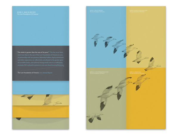
That’s why this 2010 annual report for The Law Foundation of Ontario (LFO) is especially excellent. The designer—Mike Kasperski of Matter Strategic Design—took all of that aforementioned dense information and created an annual report made up of 4 small books, each telling one great story. Book 1 is the LFO year in review, Book 2 focuses on their launch of a Justice Fund, Book 3 on a Class Proceedings Fund, and Book 4 summarizes the LFO financial statements.
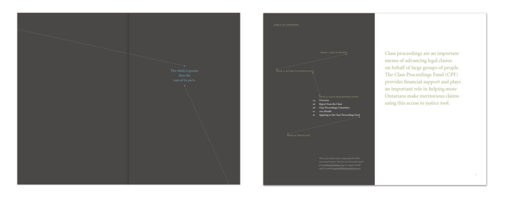
Each book is well-connected to the others. Each begins by repeating the text “the whole is greater than the sum of its parts”. That ethos—a design principle, to boot—is reinforced by the design throughout, with every book building on the others in a way that is simple, strategic, and powerful.
Take the covers: they’re all illustrated with lines snow geese. Each one is calming, open, attractive. And if you set the books down together, the geese on the covers are linked together to form a large, flying group. And there you have it, before you’ve even cracked one open. The whole IS greater than the sum of its parts. It’s a hard-working combination of focus, commitment, effort and team-work. This theme runs through the covers, the books, and —we’re lead to believe—the organization as a whole.
Designed by Mike Kasperski
A bit more on the design: each book uses only 2 spot colours, and the colours are serene and harmonious. The dotted directional lines throughout could have ended up feeling kitschy, but they don’t. They’re an interesting and energizing tool to keep the reader moving through the pages, making connections and seeking out more information. So simple, so smart. Another great thing about the design of this report? The designer used ONE typeface in this design. It’s an elegant and flexible one (Minion), with a range of weights and styles, but it is so rare to see a single typeface used for a large project—or even a small project—and Kasperski has executed it beautifully.
The report is cohesive and communicative and honours the LFO, their people and their work in such a thoughtful way. It takes a big lump of information and molds it into a thing of beauty. Check out the whole report here: http://www.lawfoundation.on.ca